Responsive Web Design (RWD) –
is the use of CSS media queries and a flexible grid to create a website design that dynamically adapts and changes according to the user’s screen size.
Adaptive Web Design (AWD) –
is when the server detects which device the user is accessing the web page from and selects a static design that matches the screen size and resolution.
Responsive vs. adaptive web design: What’s the difference?
For a website to succeed, it needs to be designed with all users in mind. Screen sizes, however, can vary from large corporate monitors to teeny-tiny smart watches, making it challenging to provide the same good UX design for a site on every device.
Both responsive and adaptive web design remove this obstacle, allowing designers to create great website experiences for every user. Let’s look at the key differences in how these design techniques accomplish this:
What is responsive web design?
Responsive web design enables a web page’s design and layout to automatically adapt to any screen size. The design technique uses CSS media queries (a tailored style sheet) to inspect the end user’s device characteristics. The website then renders itself accordingly.
Toyota‘s website exemplifies responsive design. Thanks to the fluid grid design, the homepage content flows into smaller screens with no issue. If you were to start with the mobile or desktop version of the site and slowly change the size of it, you would actually be able to see the design break and rearrange itself when the screen reached a certain percentage of the original.
The pros and cons of responsive design
Pros:
- Consistent content experience across all platforms
- Works on new devices, even those with non-standard screen dimensions
Cons:
- Less control over how the site renders on each device
- Can hinder visual hierarchy if elements reflow in the wrong order or size
- Requires more design expertise, cross-platform testing and design tweaks
- Hinders website performance as dynamic content takes more work to load
The pros and cons of adaptive design
Pros:
- Creates a perfectly-tailored experience for each platform and context
- High performing, as the design is optimized for the target device
- Easy to perfectly fit advertisements and other third-party integrated content
Cons:
- Can negatively impact SEO if content inconsistent across all devices
Among the key principles of responsive design:
- Site versions for different mobile devices in the first stages of design.
- Flexible, grid-based layout – implementing a flexible, grid-based site layout.
- Flexible images – using scalable images.
- Media queries – working with media queries.
- Use of incremental improvements.
Advantages of adaptive design over responsive design:
1. more control over exactly how the website works on a particular device,
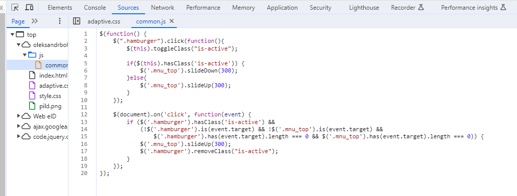
2. the site loads faster by using only those elements of the page that are necessary for the specific device.My website has an adaptive design. Made using media queries
On this link, you can see what the customisation for different devices looks like.
http://www.responsinator.com/?url=https%3A%2F%2Foleksandrbohatyrov22.thkit.ee%2F
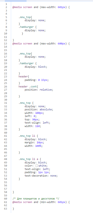
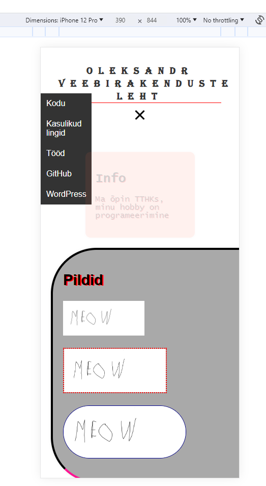
Adaptation has been made for phones and a resolution of less than 600 hamburger menu has been included
Responsive Web Design
The page changes automatically when the window is resized. Thanks to media queries
In conclusion. AWD vs RWD
Adaptive design is best used for large and comlpex sites. To load different modules. Responsive should be used for small one-page sites. But still I prefer adaptive, as you can optimize more for devices