SQL server. Insert table. Tabeli loomine
Responsive Web Design (RWD) –
on CSS meediapäringute ja paindliku ruudustiku kasutamine veebisaidi kujunduse loomisel, et see kohanduks dünaamiliselt ja muutuks vastavalt kasutaja ekraanisuurusele.
Adaptive Web Design (AWD) –
on see, kui server tuvastab, millisest seadmest kasutaja veebilehe avab, ja valib staatilise kujunduse, mis vastab ekraani suurusele ja resolutsioonile.
Responsive vs. adaptive web design: What’s the difference?
For a website to succeed, it needs to be designed with all users in mind. Screen sizes, however, can vary from large corporate monitors to teeny-tiny smart watches, making it challenging to provide the same good UX design for a site on every device.
Both responsive and adaptive web design remove this obstacle, allowing designers to create great website experiences for every user. Let’s look at the key differences in how these design techniques accomplish this:
What is responsive web design?
Responsive web design enables a web page’s design and layout to automatically adapt to any screen size. The design technique uses CSS media queries (a tailored style sheet) to inspect the end user’s device characteristics. The website then renders itself accordingly.
Toyota‘s website exemplifies responsive design. Thanks to the fluid grid design, the homepage content flows into smaller screens with no issue. If you were to start with the mobile or desktop version of the site and slowly change the size of it, you would actually be able to see the design break and rearrange itself when the screen reached a certain percentage of the original.
The pros and cons of responsive design
Pros:
- Consistent content experience across all platforms
- Works on new devices, even those with non-standard screen dimensions
Cons:
- Less control over how the site renders on each device
- Can hinder visual hierarchy if elements reflow in the wrong order or size
- Requires more design expertise, cross-platform testing and design tweaks
- Hinders website performance as dynamic content takes more work to load
The pros and cons of adaptive design
Pros:
- Creates a perfectly-tailored experience for each platform and context
- High performing, as the design is optimized for the target device
- Easy to perfectly fit advertisements and other third-party integrated content
Cons:
- Can negatively impact SEO if content inconsistent across all devices
Reageeriva disaini põhiprintsiipide hulgas:
- Saidi versioonid erinevatele mobiilseadmetele kujundamise esimestes etappides. 2.
- Paindlik, ruudustikul põhinev paigutus – paindliku, ruudustiku kasutamisel põhineva saidi paigutuse rakendamine.
- Paindlikud pildid – skaleeritavate piltide kasutamine.
- Meediapäringud – töö meediapäringutega.
- Järkjärguliste paranduste kasutamine.
Adaptiivse disaini eelised tundliku disaini ees:
1. rohkem kontrolli selle üle, kuidas veebileht konkreetses seadmes täpselt töötab,
2. sait laeb kiiremini, kuna kasutatakse ainult neid lehe elemente, mis on konkreetse seadme jaoks vajalikud.
Minu kodulehel on adaptiivne disain. Tehtud kasutades meedia päringuid
Sellel lingil näete, kuidas kohandamine erinevate seadmete jaoks välja näeb.
http://www.responsinator.com/?url=https%3A%2F%2Foleksandrbohatyrov22.thkit.ee%2F
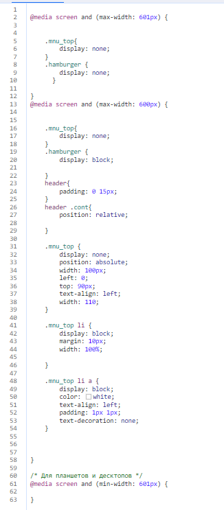
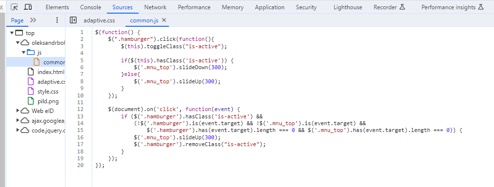
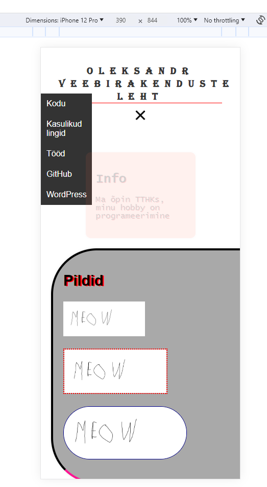
Kohandamine on tehtud telefonidele ja resolutsiooniga alla 600 hamburgeri menüü on lisatud
Responsive Web Design
Lehekülg muutub automaatselt, kui akna suurust muudetakse. Tänu meedia päringutele
In conclusion. AWD vs RWD
Adaptive design is best used for large and comlpex sites. To load different modules. Responsive should be used for small one-page sites. But still I prefer adaptive, as you can optimize more for devices